
Young College Graduate Unemployment Is Worse Than the Slowdown Explains
Unemployment for workers in their early 20s with BA+ degrees is running 2 percentage points higher than historical patterns predict.

This is a preliminary post: I’m making arguments that are testing new methods and data. Though I think it’s mostly right, I welcome feedback and may change my analysis.
I want to look at the labor market with fresh eyes as we go into 2026. And the first place I want to do this is the debate over weakening prospects for people in their 20s with college degrees. This was a highly debated topic in 2025, with a focus on whether this was consistent with an overall weakening labor market or whether it was a sign of the impact of AI in the workplace.
My loosely-held hot take a year ago would have been, echoing Joey Politano making this argument at Big Think, that AI would increase jobs in the short-run. My view is AI makes productive workers far more productive, but its unreliability makes it difficult to automate positions that require certainty over how outcomes are determined. But entry-level workers might be vulnerable, both because of the way the career ladder is structured and because bosses, wanting to cut corners, would try to haphazardly replace workers with AI there first.
And we did see unemployment increase for new college graduates. But, as friend of the blog Guy Berger has noted, unemployment is also higher for young people without a college degree, consistent with a weakening labor market and low hiring. Overall unemployment is up, from 3.5% in the summer of 2023 to around 4.4% now, and we expect that impacts younger people more.
Is there a way to distinguish if it’s increasing more than we’d expect?
Regression Relationship Approach
Let’s build up to how we’re going to approach this. There are many unemployment rates, whether for race, education, gender, or age. But they all tend to track the headline unemployment rate you hear about in the news, called U-3 unemployment, even over decades.
Let’s take two groups: (1) men and (2) workers aged 45-54, and see if their rise in unemployment tracks what we’d expect given the overall increase. (Note that the data sourcing will be important throughout this: here the data is from the BLS itself, seasonally-adjusted and monthly.)
Let’s run a regression on their individual (log) unemployment rates versus the overall (log) unemployment rate for the years 1994 to 2019. We get an equation, which we then use to project forward to 2025. We take the actual increase in U-3 unemployment and, given the historical relationship, we ask: what would we expect the specific unemployment rate for those two subgroups to be?1
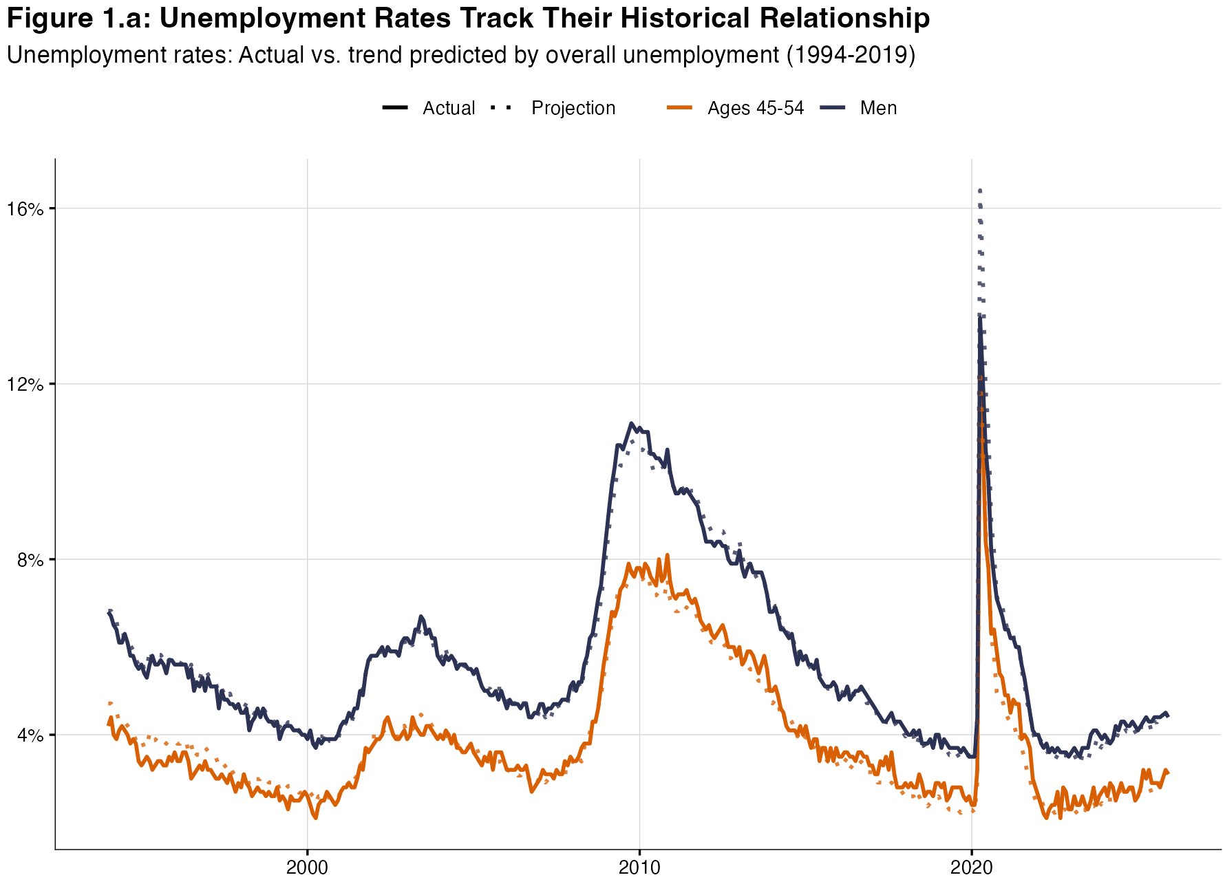
Figure 1.a shows the full history back to 1994. The dotted lines are projections based on the log-log relationship between each group’s unemployment rate and overall unemployment, trained on data through 2019. This is a pretty good fit across multiple business cycles.
Figure 1.b zooms in on the post-pandemic period, where we are projecting forward based on the 1994-2019 relationship. Both men and 45-54 year-olds track almost perfectly with their expected values. The labor market slowdown since 2023 has increased unemployment across the board, but these groups are rising exactly as much as their historical relationship with U-3 would predict. Nothing unusual here.
Multiple Groups
Let’s extend this across all demographic groups. I take seasonally adjusted monthly unemployment rates from the BLS by gender, race, age, and education, regress each against the overall unemployment rate 1994 through 2019, and calculate the average difference between actual and predicted values over the most recent 2 months:
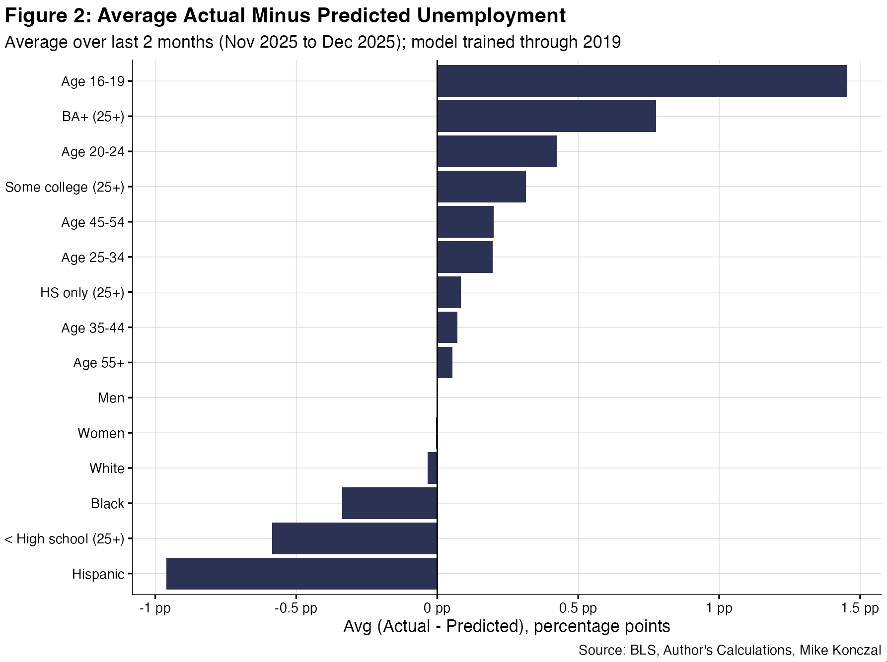
A positive value means higher than expected from 4.4% unemployment. These results are consistent across many date ranges. Most groups cluster right around zero, with their unemployment rates exactly where you’d expect given the current level of overall unemployment. But young people (16-19 and 20-24) and BA+ stands out, with unemployment notably higher than its historical relationship would predict.
Many, including myself, have noted the statistically significant increase in black unemployment over the past year. Why doesn’t that flag above? Let’s look at this more closely:
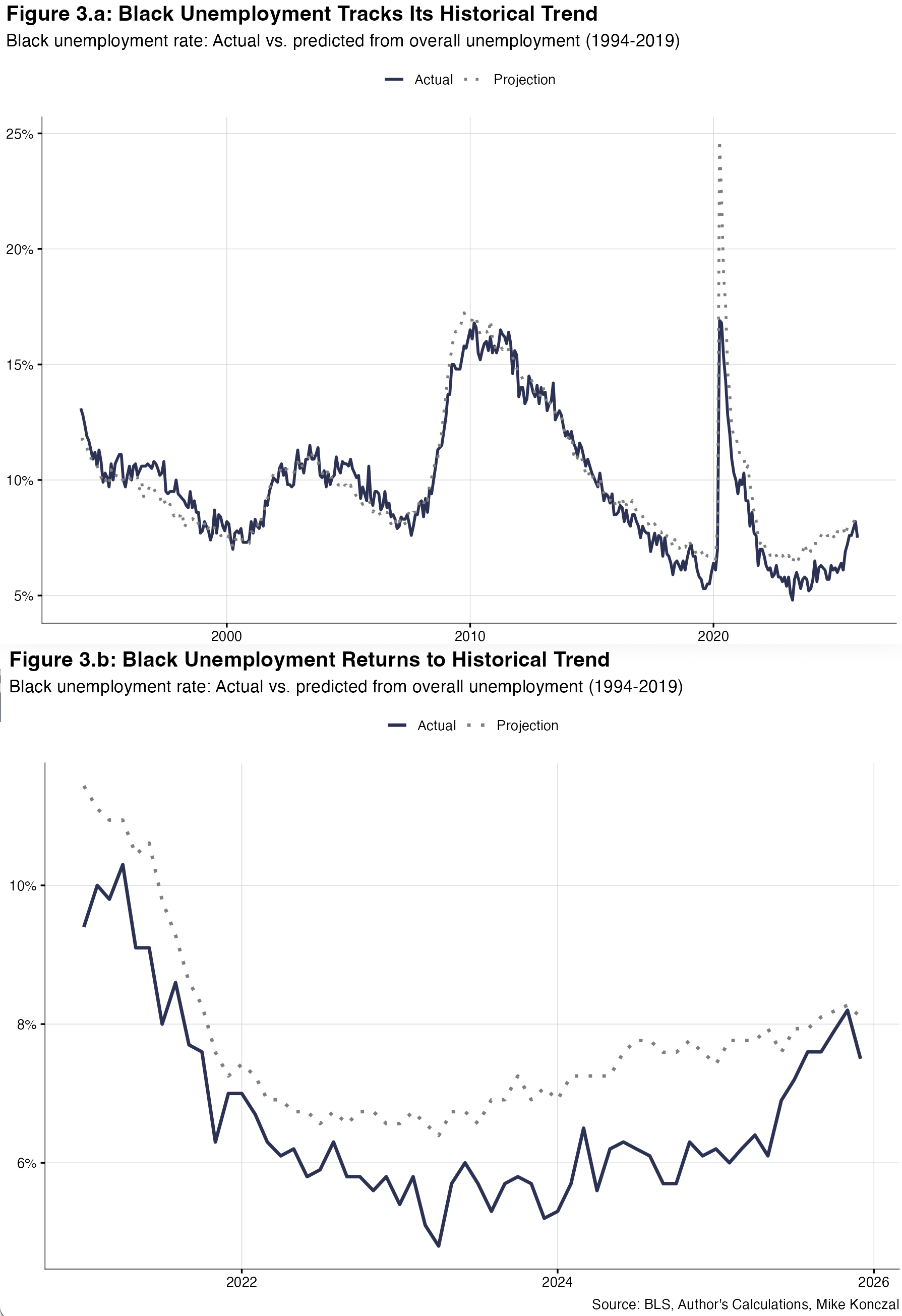
Here we can see that black unemployment has sadly returned to its longer-term trend. The tight labor market and full employment environment of 2021-2024 especially benefited black workers, with the black unemployment rate falling much further than historical patterns would predict, and the black-white unemployment gap collapsed to record lows. It’s a terrible fact that this progress has reversed in this past year. As the labor market has cooled, black unemployment has unfortunately returned to its historical, and far too high, relationship with overall unemployment.
Young People
Now to focus on younger people. Let’s take data from the New York Fed’s The Labor Market for Recent College Graduates website. This longer-standing measure was given a lot of attention last year in an article from Derek Thompson. These are 22-27 year olds. Recent grads have a completed BA or higher; young workers are everyone else. The researchers make their own seasonal adjustment. This is their creation from the microdata. Let’s run the same regression from 1990 to 2019, their starting years, and project:
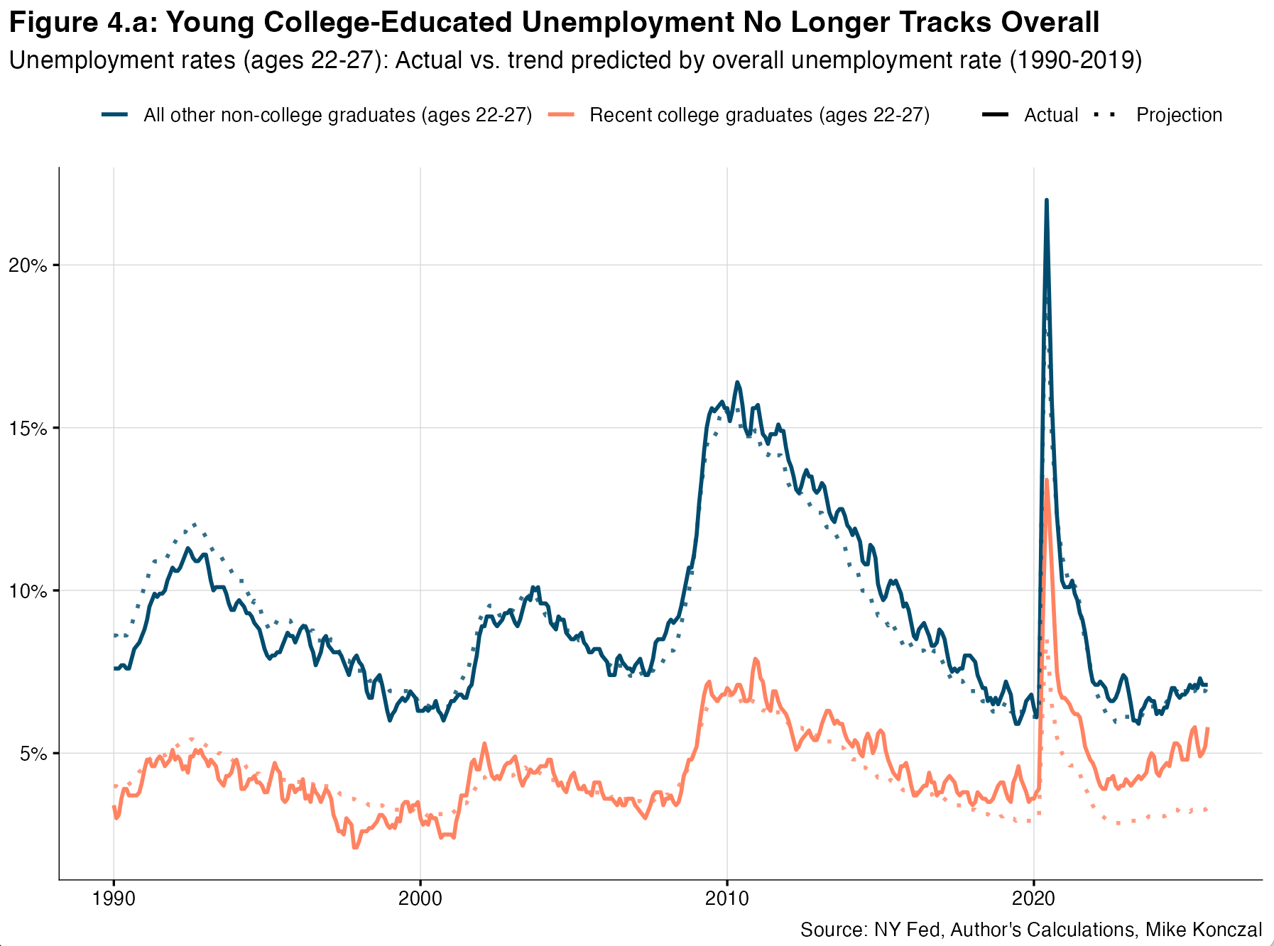
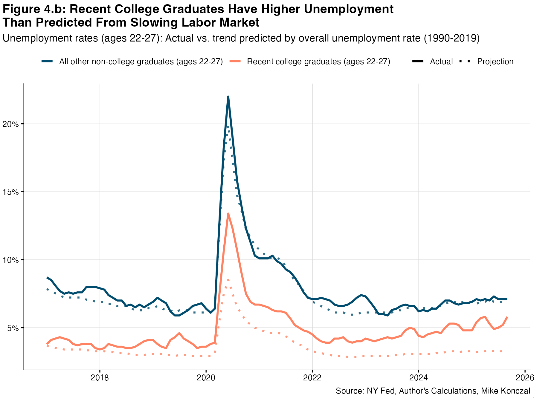
(EDIT: as requested by readers, added a new figure that shows the relationship back to 1990, and extends the recent figure back to 2017. Still same analysis.)
As you can see, people without college degrees who are 22-27 more or less track exactly what we’d expect given the labor market slowdown. But young college is much higher than our trendline we’d expect from the slowdown.
To be clear: college-educated unemployment is still lower than non-college unemployment, and everyone's unemployment is up. Let’s not get tripped up on this on social media. What's unusual is the gap between where college unemployment should be historically and where it actually is today.
Now, as John Burn-Murdoch and Guy Berger have each noted in different ways with excellent analysis, college-educated workers are likely to be new entrants to the labor force in their 20s compared to those entering the labor force earlier.2 So in a slowing labor market it might not be correct to compare these two age groups.
To dig into this, I take the BLS microdata from IPUMS and create my own categories. I use 12-month rolling values instead of seasonally adjusting the data. I take 3-year age bands (so, e.g., 22-24 for age 23) for college-plus and high-school-plus (HS+) without a BA. The College+ series starts at ages 21-23, and the HS+ series starts at ages 18-20. I then run a log-log regression on each from 1989 to 2019 and take the average difference between the projected and the actual over the past 3 months (ending in September, to avoid the month of missing data). I then chart it across the age spectrum:
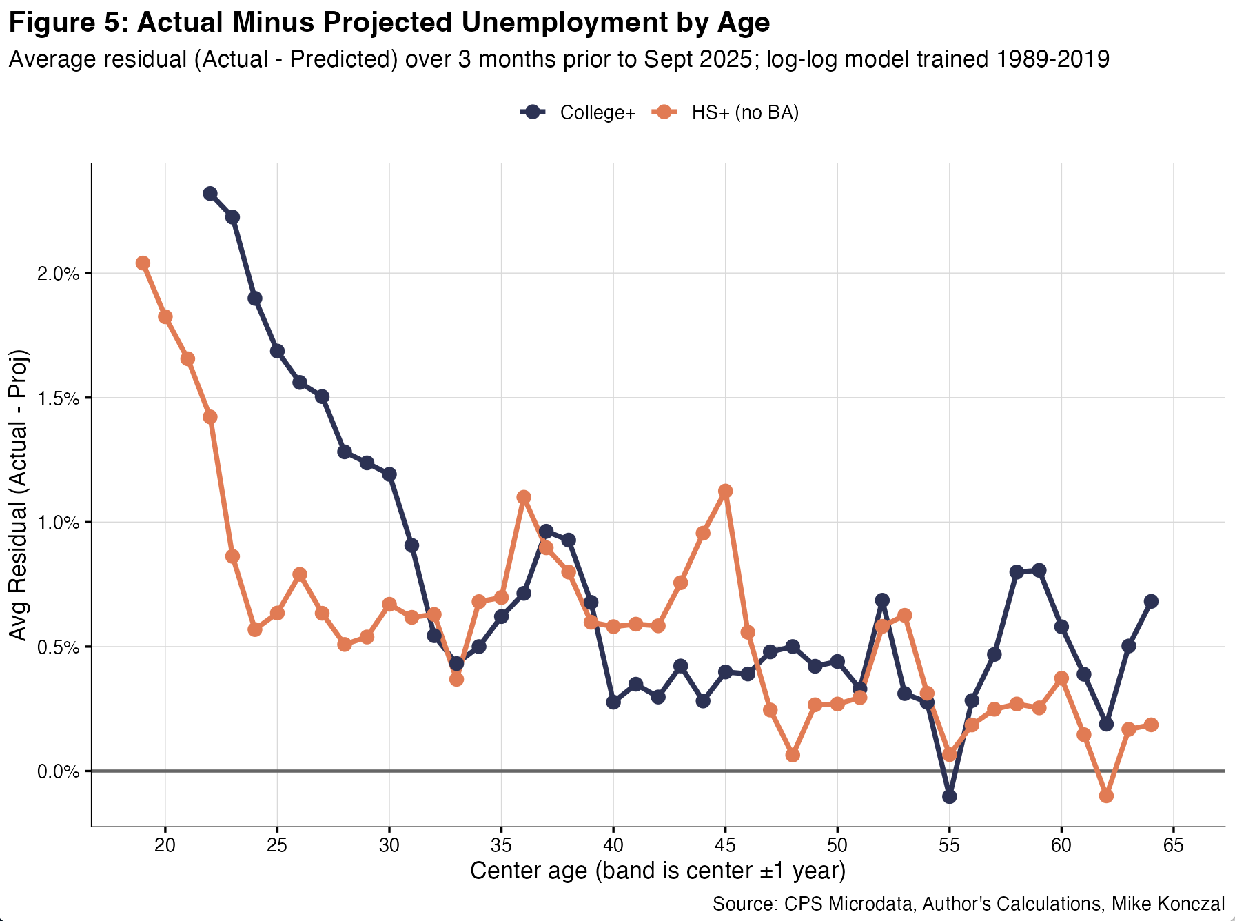
To read this graphic, for someone who is 23 (the age-range 22-24) with a BA+, they have unemployment that is over 2 percentage points more than we’d expect based on their historical relationship with overall unemployment. That excess fades by their late 20s. This gap is also high for non-college workers in their early 20s, but their peak is lower than the college one and it collapses faster.3
So my current read is that young people have higher unemployment than we’d expect at 4.4% overall unemployment. It’s especially higher at its peak and throughout their 20s for people with a college degree. Their recent unemployment rate is historically a surprise. The bad kind of surprise.
It’s worth flagging that, as new entrants have a substantial contribution to unemployment, that they don’t have previous employers. So a lot of analysis of the impact of AI, that looks at where unemployed people are coming from, won’t be useful for this group, as it’ll be NA in that microdata.
Technical, and why I’m keeping this as preliminary: why are both lines above zero for most of the age range? Testing suggests a small upward bias in the level of the residuals even before the pandemic. In pre‑COVID holdout tests (training through 2014 or 2017 and testing 2015‑2019), the mean residual is modestly positive across groups, and the all‑educations line is slightly above zero too. There are ways to reduce this bias but not eliminate it, which points to a slow drift.
Does this matter? It matters for the level, so the right comparison is to a pre‑2019 baseline, not to zero. That pattern is why I focus on the gap between young College+ and non‑college. So I think this results still holds. But if you have thoughts on how to do this better, please share!
This is true. But I’ve been noting that there’s still a timing issue when trying to make it an AI story. At least using my less sophisticated subtraction method.
It’s especially bad if you’re a black female. 7.3% unemployment rate. 3 years ago it was 4.7%