
The Girlboss Takeover Has a Data Problem
The sub-industries that already employed women just grew faster.

A new argument is growing on the post-liberal Right: that women’s economic achievements are themselves the problem. This had its cleanest articulation in a recent First Things piece by Inez Stepman, “The Myth of the Independent Girlboss,” which argues that women’s employment rates in recent decades are both unwise and illegitimate.
The argument of the piece is that women’s employment rates are currently being “propped up” by government policies. Which policies? She names several that trace to the early 1990s. She explicitly names and dates the Civil Rights Act of 1991. She references student loans the government backs, which come out of a 1993 law, as well as immigration, which particularly takes off in the 1990s. She also names other events from the past decade, like DoorDash and the growth of HR departments, which she believes accelerated women’s inflated employment rates.
This is part of a broader argument on the right, drawing on Helen Andrews on the “feminization” of corporate culture and institutions, and the broader “longhouse” discourse. (As a response, I’d read Darby Saxbe at The Argument.) Stepman has a reference to the viral social media skits of the Australian skincare company The Breakout Hack, as is standard in these arguments. Andrews times her argument to the idea women took over fields in the late 2010s, and makes two empirical points: women have reached half of workers by taking over new institutions, and once “institutions reach a 50–50 split, they tend to blow past gender parity and become more and more female.”
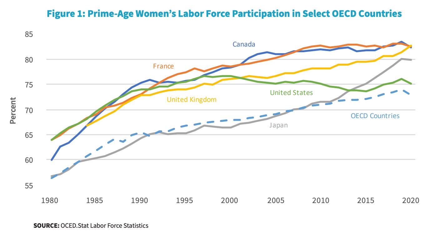
The problem with this argument is that it doesn’t fit the key labor market economic data points. Women’s labor force participation plateaued in the mid-1990s and has been flat since. As a graphic from a Treasury report shows above, it is below that of peer countries. Before that there was no particular break where it accelerated; it followed a steady trend upward from the beginning of the 20th century, a familiar U-curve tied to capitalist development. There’s been no recent takeover of industries; the fields that already employed women simply grew faster. Specific industries tend to mean-revert their gender mix.
Let’s dig in.
Women’s Labor Force Participation Plateaued in the 1990s
The most basic problem with the “women are increasingly dominating the workplace” narrative is that they aren’t. As Figure 1 shows, prime-age women’s labor force participation rate, the share of women aged 25-54 active in the labor market by working or actively looking for work, rose at a consistent pace from the 1940s through the late 1990s and then stopped.1 It has been nearly flat for a quarter century, rising only about 1 percentage point in the very strong labor market of the past few years.
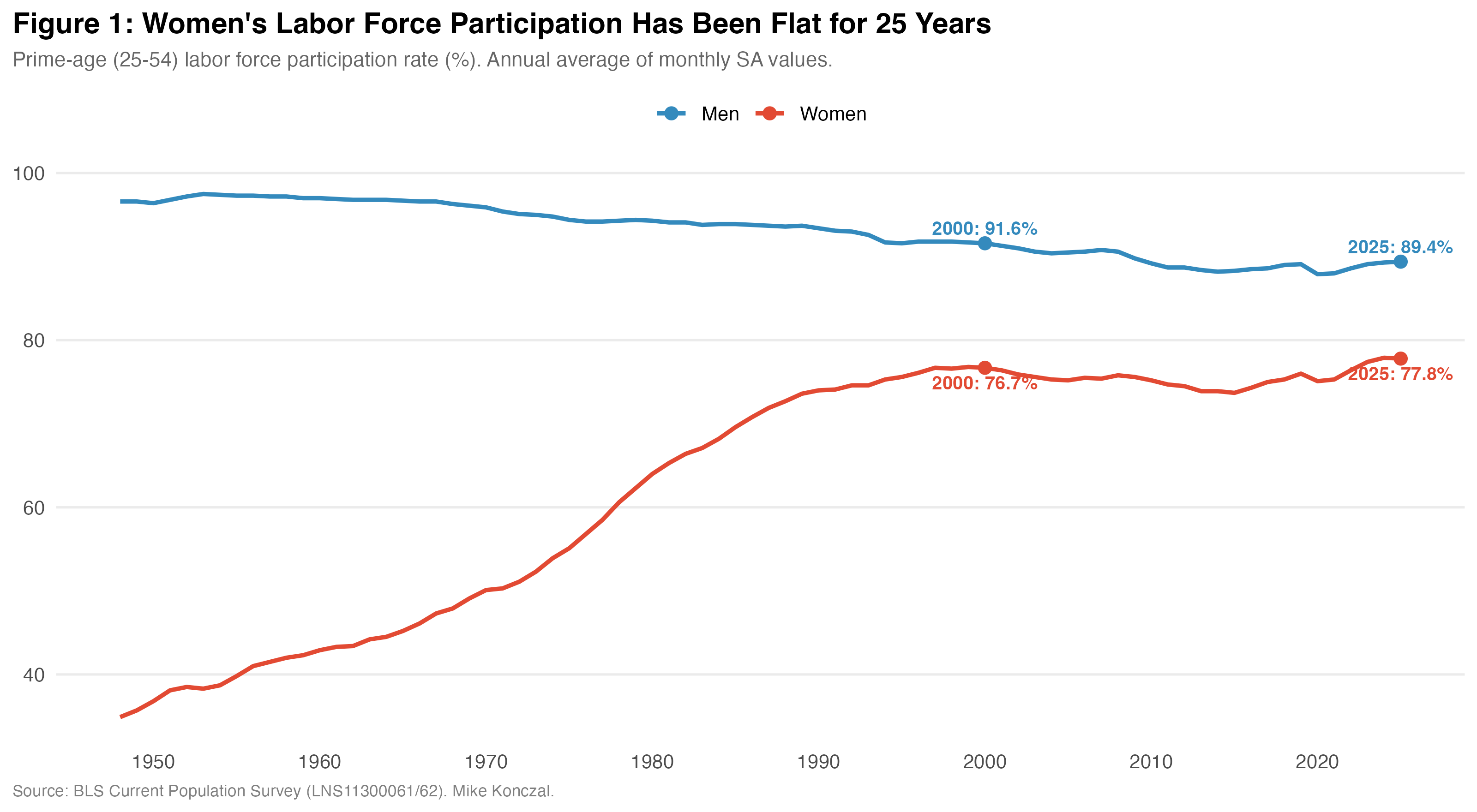
We can also see this in the employer data. The Current Employment Statistics, the employer survey behind the monthly jobs numbers, tracks total payroll employment and women’s employment at the industry level. Women’s share of total nonfarm jobs rose steadily from 32% in 1964 to 48% by 1995. Since then it has barely moved, reaching 50% in 2025. (We’ll talk about that 2 percentage point growth in a minute.) If the policies since the 1990s were supposed to turbocharge women’s entry into the labor force, there is no sign of it in any of the key data sources.

Maybe the aggregate numbers are flat because older workers mask what’s happening among younger cohorts, especially college-educated ones. We can check this directly with the CPS microdata.
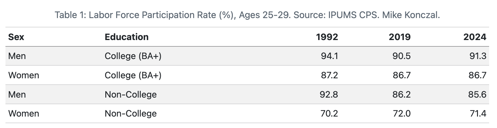
I don’t see it. As Table 1 shows2, among college-educated 20-somethings, women’s labor force participation rate has been about 4 percentage points lower than men’s in 1992, 2019, and 2024 alike. Among non-college 20-somethings the gap narrowed, but only because men's participation fell.
What About the Kinds of Jobs Women Have?
Has the composition of jobs changed? Perhaps women aren’t entering at higher rates overall but are concentrating in specific sectors and pushing men out. The data argues otherwise.
To start, consider three major sectors:
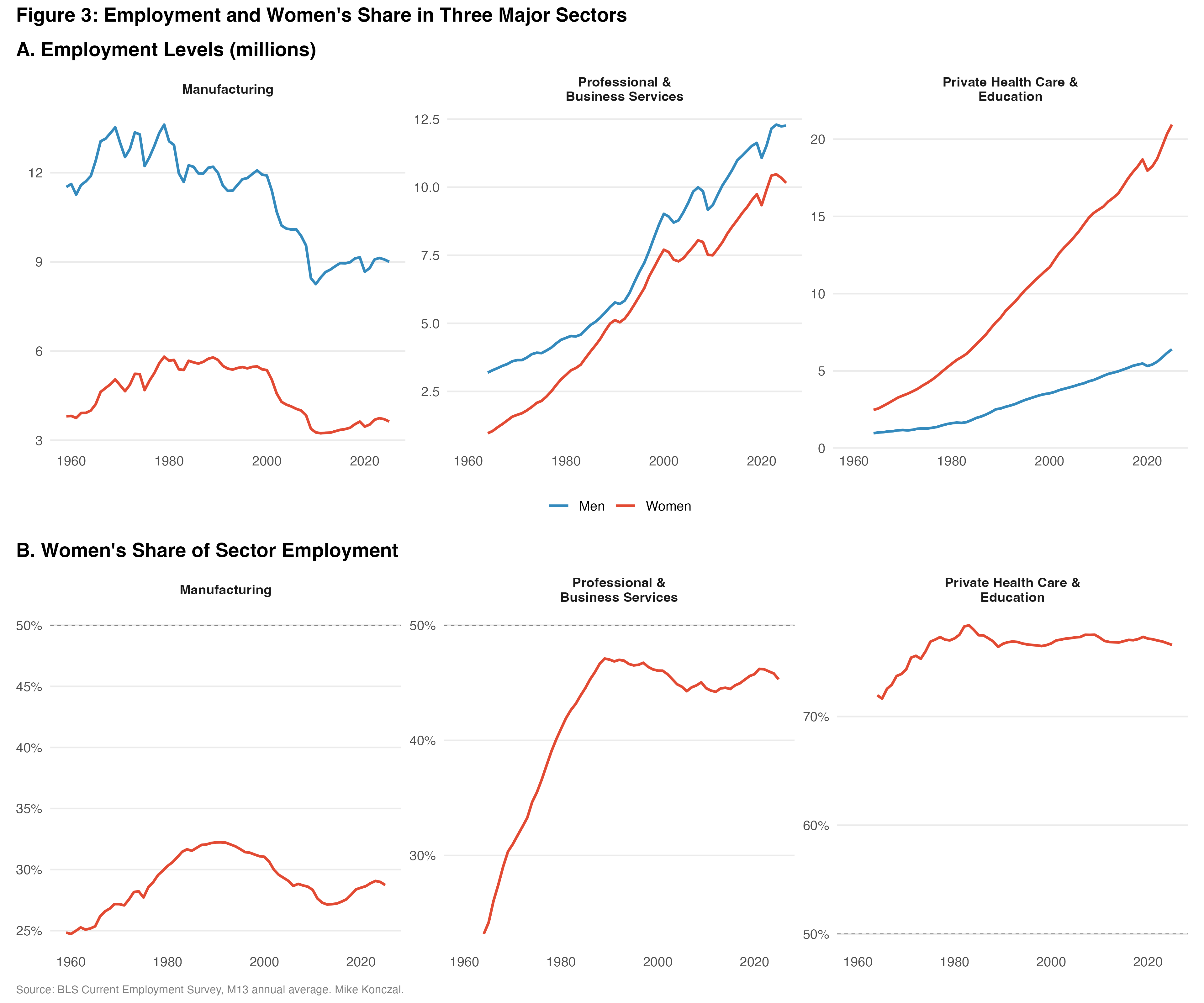
For manufacturing, men lost more jobs in absolute terms as the sector collapsed. But women lost a larger share of their jobs, so women’s representation actually fell. Women’s share went from 32% to 29%.
Over 16 million jobs were created in private education and health services since 1990, more than any other supersector. Women gained 12.5 million of those jobs and men gained 3.8 million. But women’s share was 77% in 1990 and 77% in 2025. The sector grew enormously, but its gender composition didn’t change at all.
When it comes to professional and business services, presumably the sector where the elusive girlboss lives, jobs grew enormously, adding millions of jobs for both men and women. But women’s share of the sector was 47% in 1990 and 45% in 2025. It was essentially flat, even as both men and women gained a lot of jobs.
We can test this more granularly. Economists have a set of 250 private-sector sub-industries that they use to gauge the breadth of the labor market.3 These cover 100% of the private-sector economy. Of them, 209 give us the number of female employees. These cover 93% of the private-sector economy; the missing 41 are largely small and in manufacturing, which would likely amplify the results we’re about to see.
For each of these 209 industries, we can compare women’s share in 1990 to their share in 2025. The gender composition of industries is overwhelmingly determined by where they started. The correlation between an industry’s women’s share in 1990 and its share in 2025 is 0.955. The regression line sits just below the 45-degree line, which shows mean reversion, not acceleration. Industries that started most female-dominated saw their share decline slightly on average, while the most male-dominated saw slight increases. This is the opposite of a takeover.
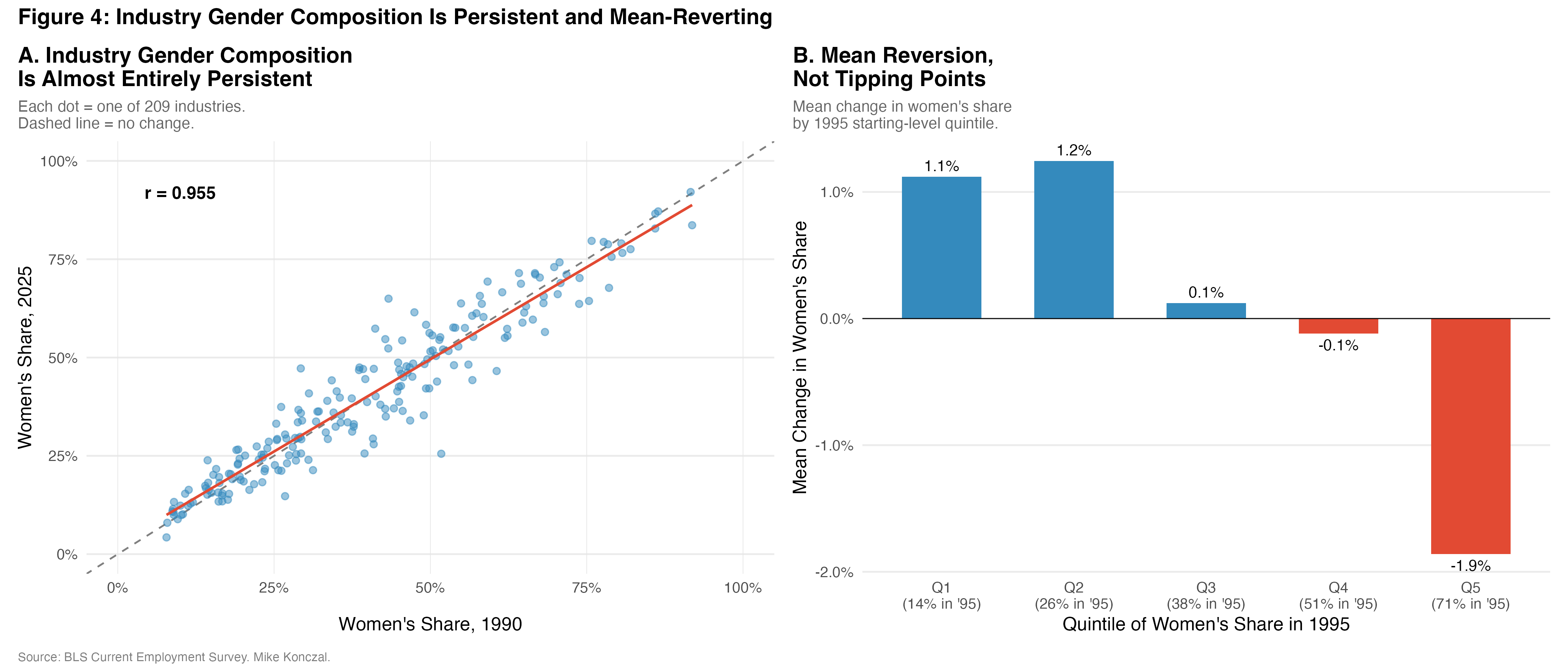
Women’s share of total employment did tick up about 2 percentage points since the 1990s, reaching the 50 percent threshold Andrews flags. How? It could be because women are taking over more jobs across all industries, an increase within industries. Or it could be because sub-industries with more women are just growing faster than the rest, like health care. That would be an increase between industries, the economy shifting toward industries that already employed more women.
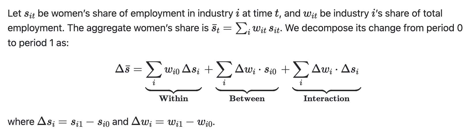
Economists call this a shift-share decomposition.4 We can use these sub-industries to ask why the aggregate women’s share of payroll employment rose over this period.
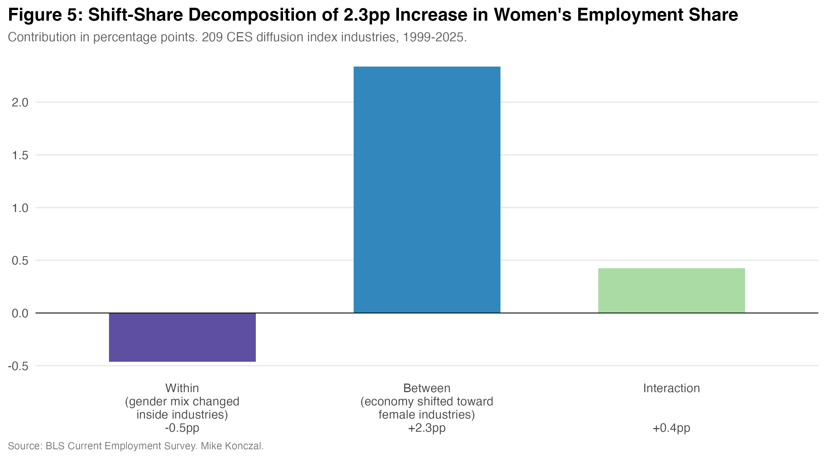
The within-industry component is -0.5 percentage points. That is, industries became slightly more male over this period. But the between-industry component is +2.3 percentage points. The entire aggregate increase, and then some, comes from the economy shifting toward industries that were already disproportionately female. Women did not move into new industries. Industries that already employed women simply grew faster. That's the story.
Ceilings and Floors
But aren’t men in crisis? As you can see from Table 1, non-college-educated men’s labor force participation has been declining for several decades. Men leaving the labor force have ended up in dark places. This is where many argue the resurgence of deaths from suicide, firearms, and overdoses shows up, dragging men’s life expectancy down.
Here’s how I think about this: we want to address the ceilings for women and the floors for men. What are the institutions that keep women’s labor force participation below that of women in other countries? And what is the floor for men who fall through in the wake of changes to capitalist development and technological change? How do we keep them from falling all the way through? We can do better than invoking girlbosses.
Github for all this data analysis is here. The CLAUDE.md is designed to meet your own AI if you fork your directory, to download the relevant data and to pick up, review, and expand the analysis.
UPDATE: Table 1 was originally published with ages 20-29 and including the year 1990, and added too few college workers for just the year 1990 because the IPUMS coding was different pre-1992. Table 1 has been updated to 1992, and uses the more helpful age range of 25-29 for analysis. The results remains the same across both.
This is the diffusion index from the Current Employment Statistics (CES). The full list is on this BLS webpage (search for “CES diffusion index series spreadsheet”). This subset is used to calculate the “diffusion index,” or the percent of industries adding jobs in any month. Weirdly, the diffusion index is one of the few BLS data series that is very helpful that isn’t on the FRED website. It’s also hidden in the monthly releases.
For those interested:
Thank you for citing my Argument piece! Your essay is excellent. I also wrote about the Stepman essay in my newsletter this week: https://darbysaxbe.substack.com/p/in-defense-of-husbands
There is a graph showing inflation by type of good. It shows that CPI is broken out into manufactured goods (that have cratered in price) and services, namely health and education, that have greatly exceeded CPI.
https://www.visualcapitalist.com/inflation-chart-tracks-price-changes-us-goods-services/
Another way of phrasing this is that male professions exist in the free market and have dramatically succeeded in making society better, so much better many of these men have lost their jobs because the sectors are so productive.
Meanwhile, the female sectors of health and education, which are largely paid for by government and feature a mix of public sector unions and professional guilds, have eaten up all surplus generated by the male sectors and returned…products whose value we can’t seem to measure (education hasn’t returned better outcomes, healthcare spends more without measurable outcomes). Everyone seems to think Amazon is a success and cars are better today, but nobody likes how our healthcare system works.
But you know what, these unproductive sectors have been very productive at creating “jobs”. It’s been a good deal to be in nursing the last few decades. And it’s been a good deal to be in teaching, at least in the blue states with the gold plated benefits/pensions and relatively high pay.
As for business and professional services it would be interesting to see a breakdown. The most female coded business professional, Human Resources, grew 64% over the last decade versus 14% for the overall economy. I suspect that trend goes back further. I don’t think any of us believe HR is adding business value, but we do know that it’s required because of government regulation and lawsuits. I have no doubt the ridiculous HR trainings I click through without reading had to be created by some women with a fake email job.