


What’s the actual inflation index to watch right now? You’ve seen that question asked many times over the past six years. We’ve gotten used to the debate over what to include in the basket, whether it’s the non-housing services Chair Powell had used or the trimmed-mean index Chair Warsh has referenced. But the question now is more fundamental and fascinating: is the actual inflation rate the Consumer Price Index (CPI) or the Personal Consumption Expenditures Index (PCE)?
Normally this is not a consideration because their relationship is usually very consistent, with CPI usually running about a third of a point higher than PCE (e.g. a 0.34-point average gap from 2011 to 2019). Since last fall that has switched.
Let’s start in Graphic 1 with the year-over-year graph for the core value, so excluding the giant energy run-up following the war with Iran as well as food, for CPI and PCE, with an additional line to show the difference between the two. A positive value of the orange line means CPI is higher in that month.
As a reminder, the Federal Reserve targets PCE for its 2 percent target. Over the past year, core PCE inflation has been 3.34%, while core CPI inflation has been 2.47%. Put that another way, core CPI is pretty close to what we’d expect at the inflation target, with a 0.13% rounding error. But core PCE is shockingly hot, 1.34% above target, something that should instigate rate hikes.
Just to show how unique this is, Graphic 2 is the difference of year-over-year core going back to the earliest available data in 1960. As you can see, with the notable exception of the early 1980s, we haven’t seen this before.
Beyond just being an interesting measurement issue, there’s also a political one here. I actually caught this earlier this year when I started noting a lot of conservative political operatives and Trump surrogates talking about how low inflation was, which made no sense to me until I realized they were talking about core CPI. There’s going to be a push to say the inflation problem is gone because CPI better represents the fundamentals than the measurement choices in PCE.
There’s also a media and commentary angle. There’s a lot of coverage of CPI because it’s genuinely unknown when it comes out first in the month. However, approximately 80% of the PCE value comes from CPI and another inflation index, the Producer Price Index. By the end of the month, when PCE comes out, it’s generally already known the small range of what the value could be. While more people are covering this, see Amni Rusli here, it is still easy for the discourse to treat inflation as lower, since it indexes so much on CPI, even while it barely covers PCE, which is raging.
However, the Federal Reserve explicitly targets PCE; that’s the index their 2% target is set against. So what’s going on here?
Background
First, let’s talk about CPI and PCE in a way that’s too quick for casual readers and will make them check out, but also takes up too much time for expert readers and gets them to click away.
The consumer price index is what consumers pay for items in the economy, while PCE includes things that are purchased on behalf of consumers. The main things that differentiate them are how often they are updated, with PCE having a chained-style updating process, and also the weights. Housing in particular is 35% of the household basket in CPI, but only about 20% in PCE, because there’s additional spending in PCE reflecting third-party-financing which increases the denominator. Because it includes spending on behalf of consumers, health care is also larger in PCE. PCE also tends to impute more items.
Normally we could dig into table 9.1U from the national accounts to understand what causes CPI and PCE to differ, but there’s two immediate and large drivers on this recent divergence.
Driver: Portfolio Services
So what’s up? First is portfolio services. If you followed inflation over the last several years, you’re probably familiar with this one. This is the stock market value and volume being imputed as real spending, though it rises mechanically from a booming stock market and generally isn’t thought to reflect real spending and incomes directly.
We can control for this though. Let’s look at market-based core PCE inflation against core CPI, as market-based is what reflects real prices (that is, not imputed) in the economy:
Over the past year, market-based core PCE inflation has been 3.03%, compared to 2.47% for core CPI. Here we can see the difference. This is down quite a bit, but it’s still elevated. So of the 0.87-point difference, something like 0.31 point is associated with portfolio services.
Driver - AI
While there’s a general sense that portfolio services isn’t reflecting actual economic conditions, the next category, which has been discussed by many (Tiffany Wilding at PIMCO had a good writeup, here is a FEDS Notes) is software, which is a proxy for AI.
Graphic 4 shows how much software as a category has gone up during this AI investment wave.
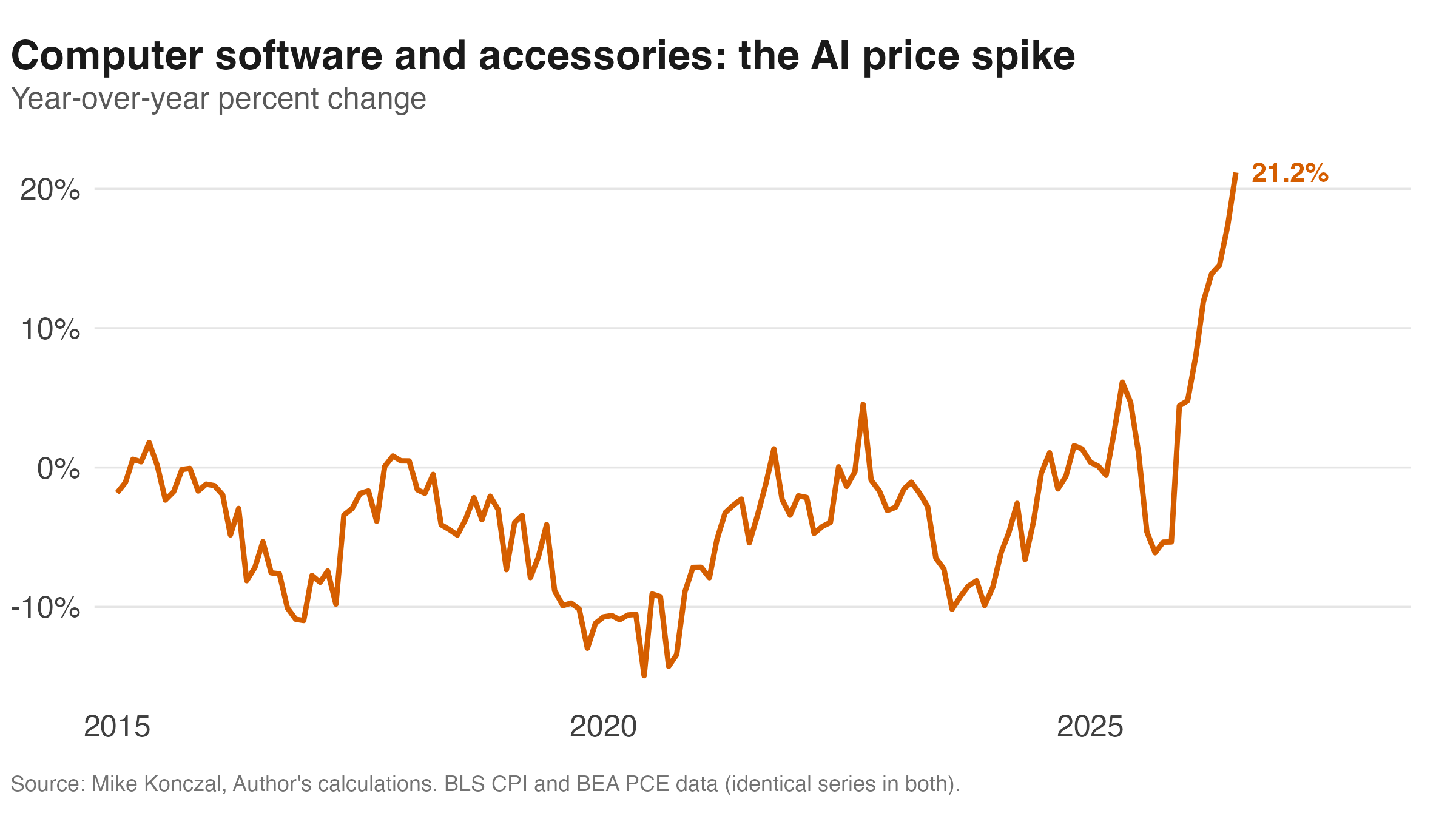
Software here is measured with the same underlying price index for CPI and PCE right now (that’s changing in September, more below), and it’s defined as spending on software publishers and data-processing/hosting services, plus, on the CPI side, some physical media like flash drives and blank discs. But they have very different weights.
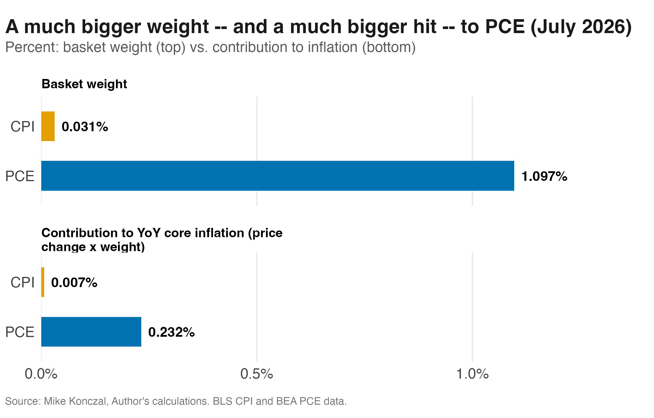
As you can see in Graphic 5 above, it has a 0.03% weight in CPI but a 1.10% weight in PCE, reflecting the broader spending in PCE. This means the runup reflects a much larger push in PCE than CPI.
Now AI spending is a real issue in inflation. Pressure and bottleneck in AI investments and spillovers into adjacent pricing items reflect real demand and real economy-wide constraints. Now there is an argument, made by Goldman Sachs’s Megan Peters, that the U.S. measurement is both too high and also internationally unique.
The smart people at BEA understand this. There’s a change coming at the end of September that swaps in better source data for software, portfolio management services, and legal services. With that in mind though, Goldman’s economists estimate the net effect would only lower core PCE by about 0.2 percentage points, some more but not all the way.
Boutique Inflation
To try and get a broader sense, here are some other market-based measures of PCE inflation, as a year-over-year chart and then slices by date, in Graphic/Table 6 below.
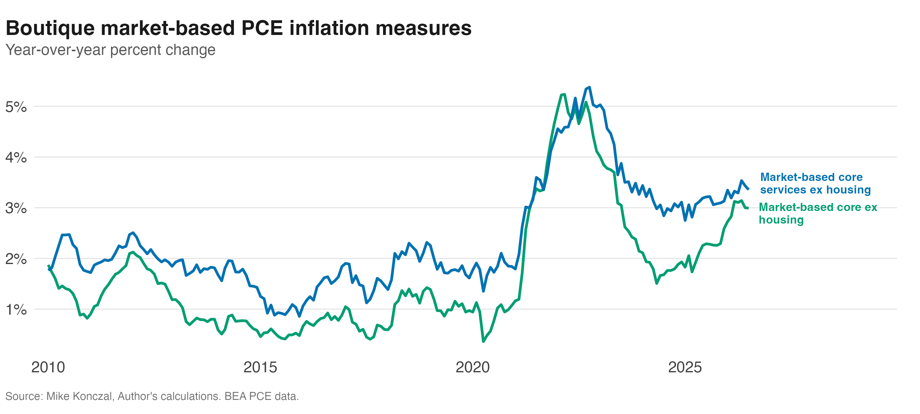
Looking over the past six months, inflation is still very elevated across all these different measures. The best case you could make is that market-based core non-housing services isn’t elevated because it’s equivalent to its 2002 to 2007 range. However, services were just a smaller part of the basket back then. That we have to slice this thing so thinly to get a case that inflation is managed strikes me as worrying. Maybe you can make that case, but you’d have to be much more of a basket-weaving merit-badge winner than I’m capable of being to even begin to see the case for a hike. What are you thinking? Leave a comment below with your take!
Being neither an economist nor a statistician, I could devote many hours to trying to understand your point -- and still end up not understanding it. But, having read you detailed analysis, I arrive at two 30,000 ft conclusions:
1. There is more than one way to fillet a fish (no cat skinning, pls!). Depending on how you fillet that fish, we have or don't have an inflation issue. However filleted, you have a bone to pick with the way commentators and the Trump administration are presenting this issue.
2. This may be an example of how to --perhaps not outright lie but nevertheless -- obfuscate with statistics.
No basketry merit badge for me, but I come away nonetheless feeling that I've learned something.
Important discussion and one of the worries I had about potentially picking different inflation measures (not to mention all the other options like trimmed mean etc).
If we want to get even more granular, inflation is different for each of the income groups. If lower income households are assumed to have a higher shelter spend, then CPI (not Core) for low income households will be about 0.2-0.3pp higher.